
User interface: a question of functional aspects, not personal taste
Software is designed starting from the needs of the users, not subjective esthetic needs
By Niccolò Maria Menozzi
People use applications when they want to make their lives easier. For this reason our software user interface is based on the needs of the users. When the user interface is really functional it is also esthetically suitable.
We have already looked at some of the reasons for which internet websites are created based on content, focusing particularly on the role of the text, the copywriting and more in general the information.
In this article, instead, I would like to express some thoughts that, leaving aside company websites, focus on more complex software, web apps and the relation between user interfaces, content and purpose.
First of all, software meets functional needs
Think about your everyday life: scrolling through Instagram photos or using an online tool in the office, every time you interact with software your attention is on a list of activities you have to perform for which you need specific information and functions.
Now, how much time do you spend thinking about whether you like the software interface or not, based on your personal taste? Probably very little, if you think about it at all. It would be perfectly acceptable and normal, after all, in these moments you are busy performing precise interactions. From this point of view we can say that we are more interested in the content and our operative needs and they are infinitely more important than their container, i.e. the interface.
Having said this, although we can all agree that the container is less important than the content, the esthetics of an interface are not something to be ignored, usually for marketing reasons (those who deal with sales and design know this well) and, in the case of software, for another reason we will explain below.
Functional also means having visual logic
The graphic component is intertwined with the functional aspects: think of the times you have complained about a command with an icon that you couldn’t recognise, a button with a color that made it hard to see, a text so small that it was hard to read or a character with an unreadable font.
These are all functional problems: a particular visual characteristic makes it difficult for us to do what we need to.
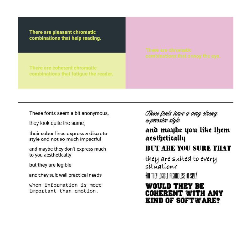
Although the form of things helps create our opinion on what we like according to subjective logic, you may notice that the functional examples given are connected to situations in which they are created badly yet not visually unpleasant per se.
Indeed you may like the icons, the button and the text mentioned just now: the style, the color and the font may match what you personally like despite not being functional in these contexts.
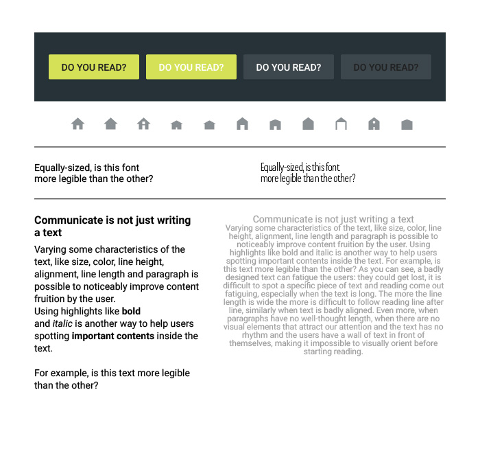
We therefore have a nuanced situation, a vague yet substantial overlap between what is graphically functional and what is satisfying on a personal level.
So, what should the priorities of those involved in software interface design be?
For us at Dreamonkey, we must strive for what is done well. You already know the reason: the users are interested in content, so we have to design to make it really user friendly, making every possible effort not to get distracted by what is subjectively esthetically pleasing.
This leads us to another issue: how can you get the best functional result from the content?
Prototyping as food for thought
The first answer to the previous question that comes to mind is: with software prototyping.
The team of designers and developers perform an in-depth end-user needs analysis, with regard to the information they are looking for and the activities they have to perform, to offer the most suitable solution, trying at the same time to remove as many of the obstacles as possible that they may encounter during use.
Some of the most important questions to ask are: what information is the user looking for? What do they need to do? What tools do they need to do it? Where should they be placed to make them intuitive? What situation will they be used in? On the other hand, what information and tools seem necessary, but are really superfluous and potentially confusing?
Requirements analysis, wireframes and mockups are all steps that contribute in different ways to the final result.
Interviewing the users is also another good practice adopted by those who deal with user experience to identify data, the most useful and vital functions and especially in the case of software to be restored, the most common problems encountered during the use of the version to be updated.
The designers are required to put themselves in others’ shoes in a detached way, with a critical approach towards the requests of the client - or management - and towards themselves. This represents a real moment of reflection in which it would be better to put aside any preconceived notions that may limit the ability to see the solutions that really work and accept the conclusions that come from the overview of the data collected.

Unfortunately, every software project is the result of a compromise, so we have to be aware of the fact that it isn’t always possible to work in the best possible way and there is a clear line between the ideal and real situations. You can work to try and reduce the negative aspects as much as possible, but you cannot eliminate them completely.
The roadmap of the team is not set out according to the desire to create a subjectively esthetically pleasing interface, but one that is esthetically pleasing in a functional sense.
Why then can’t certain clients and IT departments focus on the importance of these aspects and why do they ignore the phases that set the basis for software that is really designed to make the lives of users easier?
Identifying important content is not always intuitive
Working directly on the update of existing interfaces and offering consultation to other development teams I have realised that this approach is not as intuitive as you might think and that it is not always dealt with methodically and in-depth.
When you are working with a full agenda it’s not always easy to take the time to sit around a table and wade through these topics. Being in a hurry may lead you to think that it is better to get straight down to the implementation phase, but we should really learn to assign greater importance to the time dedicated to the thought process.
Launching into the coding phase can cause quite a number of problems, especially without a suitably trained professional who can act as a guide and coordinator to deal with this planning aspect.
With managers making hurried requests, developers having to improvise as designers, outdated methods and tools and digital workers who are lagging behind on some crucial aspects of online platforms development, there is definitely room for improvement in this aspect of our daily reality which is here to stay, at least for the coming years.
Considering the presence of so many hybrid or improvised profiles, I feel I need to put forward at least two aspects which determine the problem.
What is missing in the world of company software
On one hand the lack of trained professionals, either inside or outside the company, to deal specifically with these needs and UX/UI.
On the other hand the digital knowledge gap – with particular reference to the Italian situation – which gets in the way of a new vision in the world of web interfaces in the fields of industry, manufacturing, production plants etc.
These areas do not feel they have brand or image needs towards the consumer public which has lead to the assumption that it was not necessary to invest in this direction (in any case with different objectives from companies that are more in the public eye such as in fashion, food and tech), but this is not the case.
This vision must come from the knowledge that the study and design of effective interfaces helps us improve productivity and effectiveness and will help us even more in the future, in these and in many other sectors because the Internet and the digital space are here to stay and will extend to even more aspects of our lives.
Ignoring the topic means labelling it as a secondary software issue and offering workers – and more in general people – increasingly complex tools with incredible possibilities while at the same time making what should be simple more difficult.
The academic and training fields should consolidate suitable courses to legitimise this kind of know-how and companies that want to compete on the coming market should start to increase investment to take advantage of it.
If you think this topic is worth looking into, Dreamonkey is here to advise you. Contact us for consultation or an estimate.