
The new official Quasar logo
The open source framework starts rebranding
By Niccolò Maria Menozzi
Over the last two months we have taken on the Quasar framework rebranding project to relaunch the communication strategy. In this article we will talk about how we got to the restyling of the official logo and the new manual.
In February we shared the results of the survey done last winter and published an official review and our article 2020 Quasar survey: thoughts on framework communication. As per the roadmap, we got started straight away on the image of the project, beginning with the rebranding.
We wanted a fresh identity that would still respect Quasar’s history to this date. The open source framework has existed since 2015 which is enough time to create a certain image in the minds of those who deal with web technologies. The restyling was necessary, but without whitewashing the past.
Moodboards and creative concept
The creative process started with the creation of moodboards to identify the look-and-feel of the brand identity. Due to the specific nature of the Quasar name, we started straight away from the overriding space theme developed in 3 concepts: space travel, the frontier planet and the alien ecosystem. For each one we wanted to try ideas that moved gradually further and further away from the old Quasar style, but for all three we started from certain well-defined values and concepts we wanted to express.
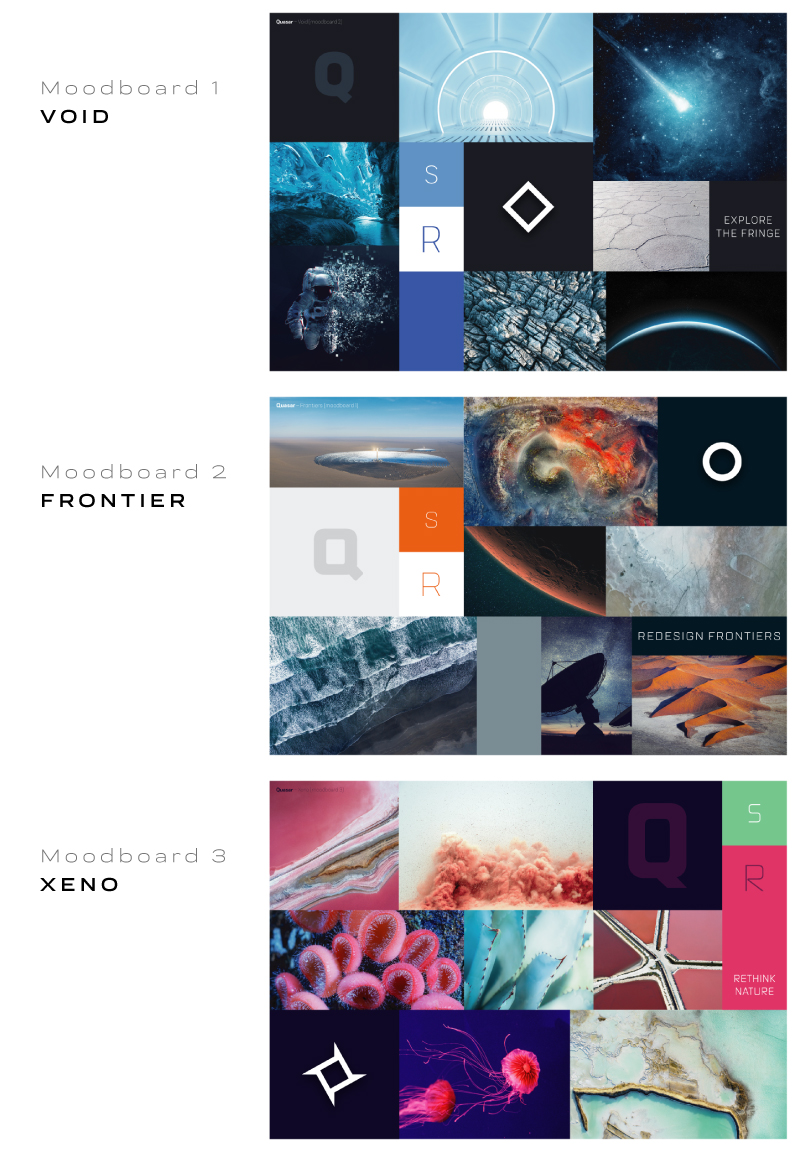
During the brainstorming sessions we also considered being more conceptual and abstract, moving away from the space iconography. However, looking at the frameworks branding field, we decided to go for more courageous visual storytelling to underline the Quasar character.
We discussed the concepts with the project creator, Razvan Stoenescu. We did not just validate a visual mood, but we also confirmed the inspirational concepts relating to the framework that Quasar must communicate from now on.
The space travel concept passed the selection phase, also for continuity with the existing look. Razvan claimed that he was satisfied with the ability to bring together the imagery, the ideals and the emotions that inspired him in the original naming and website creation phases.
Since then we have worked to bring maturity to a creative intuition that has always been at the core of Quasar since the beginning and which was just waiting to blossom thanks to a certain professional sensitivity.
Logo concept
We started with the idea of abandoning the old icon and, after discarding a few lettering concepts we decided to look on the Internet for inspiration.
![]()
Online we found many logos with varying degrees of effectiveness, often simply stylistic exercises that were never actually used.
We mapped a part of them according to the professional look of the graphic style and the level of abstraction of the image.This helped us to decide what direction to take and which ideas to exclude.
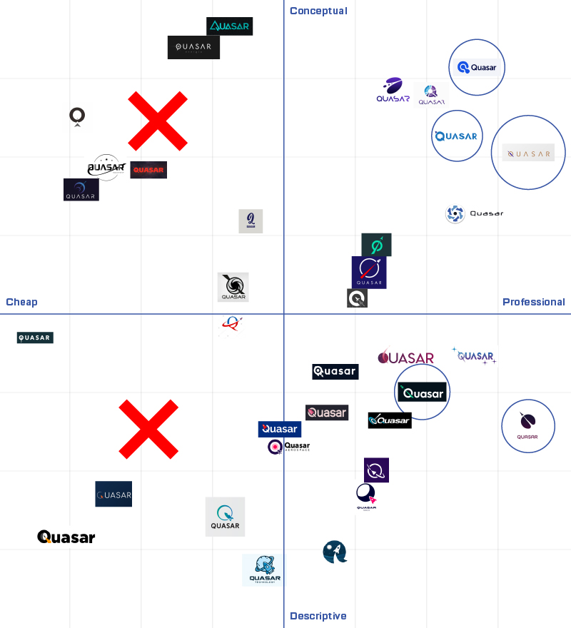
Once we became aware of the style that needed to be adopted, albeit a bit disappointed with the results of the research, we took a step back and asked ourselves if we were perhaps looking for an alternative out of a desire for change that wasn’t really necessary?
The new Quasar logo
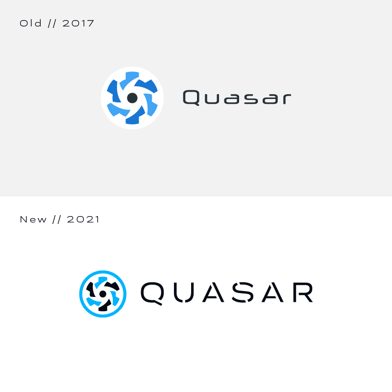
The original logo created by Emanuele Bertoldi in 2017 came out well: the icon shows two elements that are symbolically connected to the project (the cog as a tool/machine and the vortex of a space quasar), it is minimal, harmonious and visually interesting. After careful consideration, we decided to keep the logo and just introduce a few small changes.
![]()
The most important part of the work was substituting the old logotype using a more modern and sophisticated font. The uppercase character with accentuated letter spacing and the changes to make it a stencil were influenced by sci-fi and the lettering of heavy or exploratory vehicles, but it would be difficult to pinpoint a precise source of inspiration.
One of the logo versions has been enriched with a payoff that expands brand communication. Perhaps we’ll talk about how this copywriting choice was validated in a future article.
The first Quasar logo manual
Once the creative process was concluded, we created a brief logo manual to present the work done and as a summary of the most important concepts to apply for correct use of the most essential elements of the new brand identity. We have defined some variants of the logo, a color palette, the official typography and the new payoff.
The resulting document is purposely minimal and is also in part a brand guide. We feel that a fluid context such as that of the web can benefit from a flexible brand approach, defined and recognisable, but free from excessive project limitations.
One small step for the brand, one giant leap for Quasar
While still maintaining important brand coherence, brand identities are never written in stone. They are being continuously perfected, they adapt to new concepts and become more mature as those who use it test their potential and limits.
Today the objective is to bring value to the Quasar resources and express the real technological value. We are confident that the new look can add the required professional dignity to look interesting and reliable to companies who may want to adopt this technology and use the enterprise support services.
The new challenge facing us in the coming months is the update of the official website of the framework which will be the testing ground for the work done up to this point. It will also be an important opportunity to enrich the visual narration set out by the manual integrating the copywriting, another important element in the effectiveness of a brand.
Would you like to know more about our sponsorship of Quasar or would like a consultation to adopt this incredible open source technology in your company? Contact us.
If you would like more content subscribe to our newsletter.