
How to design responsive UI on a budget
Practical tips for software with little time and design resources
By Niccolò Maria Menozzi
Where to start when designing a ‘minimal’ responsive UI for software when there is no time or budget? What should you prioritise to achieve a professional frontend, without investing excessive resources? Let’s look together at some tips for designing the essentials.
On the subject of responsive design, one can read many opinions and there are countless articles and videos about it. Much of this content is theoretical best practices, sometimes far from the real constraints of a project. I refer in particular to the needs of many companies offering software development services and often managing projects with limited budgets.
According to my personal experience (limited, but real and which I have seen with my own eyes), in most cases this means one thing: first of all, you cut design. The reason is simple: the client-company is often satisfied when the software looks good enough and is operative. In the complex (and often chaotic) business dynamics of the client, there is no place for a Figma project, perfect in every nuance of UX/UI, but not working.
Cutting design does not necessarily imply doing aesthetically ‘ugly’ work (forgive the simplification, I think designers understand what I mean), or assembled without criteria. In Dreamonkey, this occurrence roughly corresponds to the need to keep the designer on the project for as little time as possible.
Less time may mean doing the same things, but in a hurry, or taking care of only the strictly necessary parts and leaving the finer details for future contracts (hoping the customer cares about improving the piece of software!). Almost every time, cutting includes the different viewports design to document the responsive UI. So let’s see how to manage this aspect so as to do as good as possible.
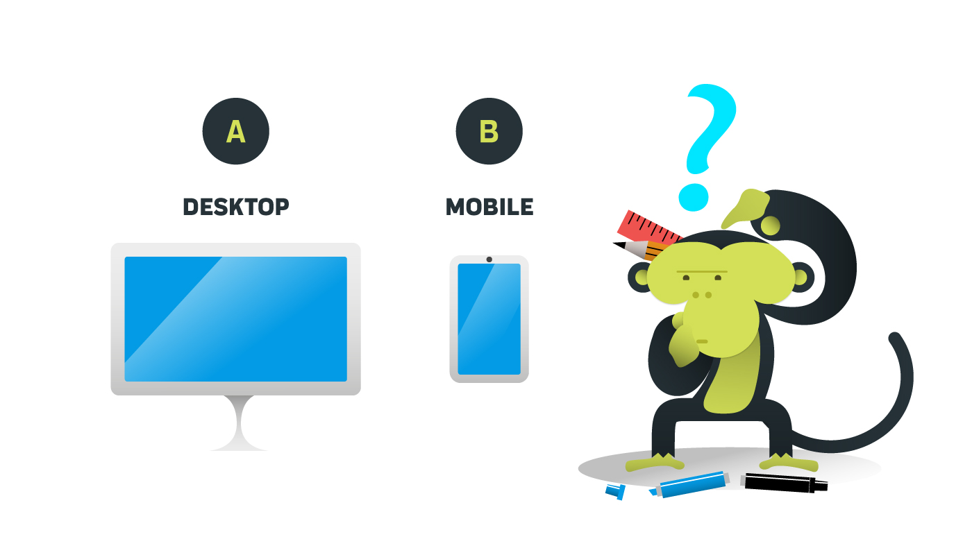
Mobile or Desktop, that is the question
Right from the start we adopt a very pragmatic approach. When starting a new project, the first discriminating factor – trivial, if you like – is to define which destination is really imperative to get going. Mobile or Desktop? The answer is simple: if it is possible, both. If the budget does not allow it, one must necessarily do elimination and integrate the missing part in the future, if and when new resources are allocated to the project.
Very often it is easy to understand what to give up. Especially in the case of software for internal company use or for particular target users. Many software designed for office work tasks are useful almost exclusively from desktop. Other apps provide for an intersecting use with other activities and, by their nature, are only useful - if not indispensable - from mobile devices. Of course, each case has its own peculiarities, but in a restrictive scenario, customer and supplier are usually able to choose intuitively.
It is not a question of what would be best to do, but what actually can be done for that project at that specific moment. Whether desktop, mobile, or a mix of both, you still have to address another issue as well: what viewports to choose to design my static UI mockups?
Planning viewports pragmatically
There are hundreds of different devices and just as many viewports. For the average software house designer, structuring a project that takes them all into account, designing static mockups and well-documented specifications for the development handoff is pure utopia. Unless you are a designer employed full-time in a startup or a company where you have to deal with a single software product. When the average software house starts a new project – especially a low-budget one – this is unthinkable.
As is often the case, in the average software house, the designer works alone, surrounded by developers. He deals with various things (UI, graphic design, copywriting…), manages multiple projects and juggles to maintain the consistency of any software that comes his way. All this between direction changes, interruptions and code technical limitations, in an eternal multitasking wheel.
So, is it really true that design should consider them all in detail? In a perfect world, yes, but let’s be honest, when does that really happen? Let’s leave this rhetoric behind and be honest.
Which viewports to choose for UI design
Given the time and budget constraints typical of many projects, at most, the designer can strive for a good compromise between responsiveness and maintainability by choosing a basic group of viewports to focus on. This choice is based on purely logical criteria and, with rare exceptions, is good for many projects without too many problems.
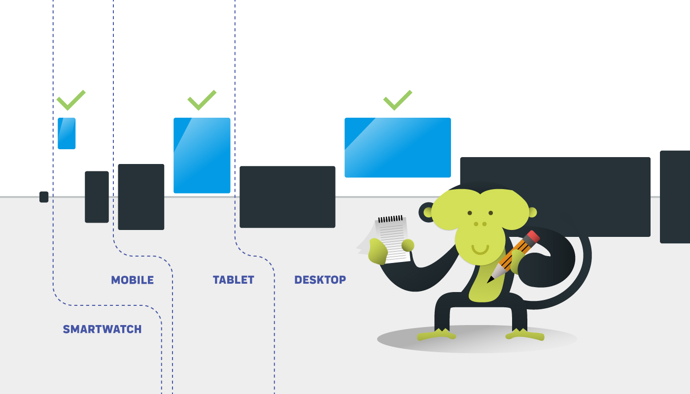
When a Figma project includes a desktop and a mobile viewport, it is already a good result. When a tablet viewport is added, it is even better. From here on, increasing the number of viewports will make your developers happier, but this is a scenario for projects with large budgets and supported in the long run by a client’s solid strategic vision (in other words: willing to invest).
In many cases, including devices such as smartwatches and ultra wide screens (more than 1920 pixels) is a nice to have. Especially the former are a rare necessity in the B2B branch.
Wide screen viewports UI
As for larger screens, they are only occasionally seen in many work areas due to their cost (the needs of the average employee rarely justify the investment). The extension of the responsive UI to ultra-wide screens also entails some possible problems.
Some images, such as headers or other photographic surfaces designed to extend, may pixelate due to their excessive size, unless extremely large images are used. Very large images, however, are not always available. In addition, they weigh more, and their use involves a number of optimisations to prevent them from negatively impacting the performance of smaller viewports, where their use is detrimental to loading time.
Another problem concerns the relationship between surface area and size of UI elements. Viewports that are too large containing UI that is too small may become annoying to consult. The user may be forced to search for information on a surface that is too large. (did someone say like butter scraped over too much bread, by chance?), impacting on his attention.
On the contrary, a responsive UI designed to scale to that size could still be annoyingly large, cumbersome and tedious to scroll through.
It goes without saying that the criteria for judging the boundaries of these issues deserve more space, but that may be a subject for another article. For now, let’s limit ourselves to providing a quick guideline to define the operations perimeter.
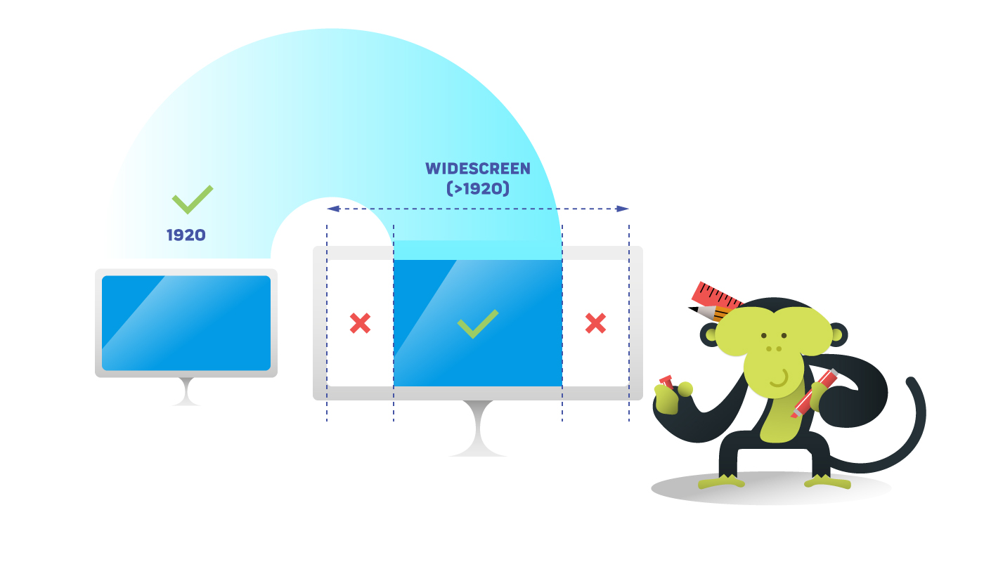
For the listed reasons, as a quick alternative solution with no catastrophic drawbacks, it is preferable to limit the software UI to a 1920 pixels maximum viewport, setting simple margins left and right for larger viewports. These will fill (e.g. with white colour) the excess space. The limitation to 1920 is justified by the fact that often, in the spectrum of viewports exceeding the tablet, people adopt a smaller screen laptop, and in the case of desktops it is rare to see larger screens in offices.
Smartphone mobile UI
As far as viewports for smartphones are concerned, the choice is very wide (just look at the artboard presets of Figma or the viewport options of Chrome’s developer tools). For projects with a limited budget you have to choose one. Even more than one, actually, but it depends on how fast you are to design on Figma (or with other software) and what was sold to the customer. In my experience, a viewport suffices to structure a more than decent project, almost every time.
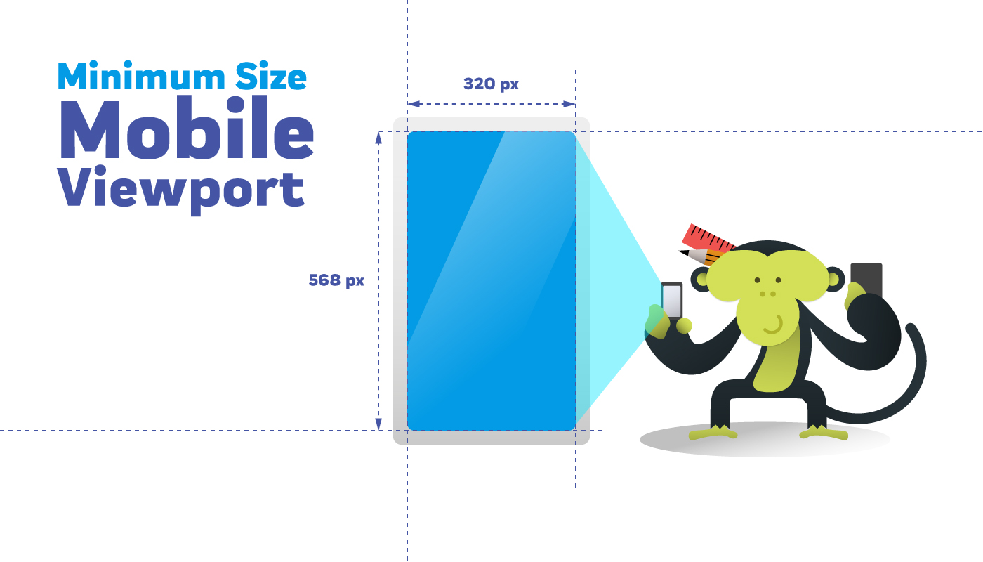
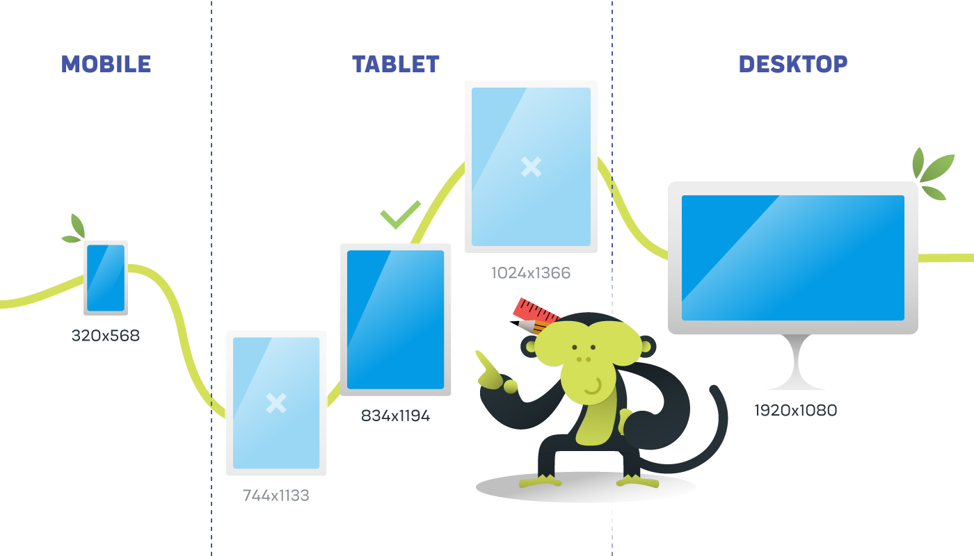
One option is to start with the smallest standard viewport, commonly considered to be that of the iPhone 5 and iPhone SE (Special Edition), that is 320x568 pixels. It is an extremely small viewport that imposes many space constraints, but it will give you the confidence to make content usable even on older devices.
One of this choice cons is that when reviewing mockups (on Figma, on Zeplin, etc.), the customer may want to see a larger viewport with a ‘modern’ feel. Let’s face it, the size of the iPhone 5 is less ‘wow effect’ than other smartphones, but as designers we should prioritise functionality. If the budget limits us, this should be the first rational choice, regardless of the customer’s aesthetic wishes.
If you are lucky and the situation permits it, integrate other mockups with larger mobile viewports, perhaps opting for a 400 pixels width or more. In this case, I have no particular suggestions as to which one to choose. Just make sure you find a middle ground between the smallest viewport and the viewport you would theoretically adopt for the smallest tablet UI.
Tablet UI
However much they may vary in size, different tablets’ viewports will never be extremely distant from each other. Having to choose just one, we must target the sweet spot between smartphone and desktop that suits us.
There are tablets that are pretty much comparable in size to laptops (Surface Pro 8, 1440x960 pixels) or smartphones (iPad Mini 8.3, 744x1133 pixels). It is true that some interactions may require additional attention but, in the case of tight constraints, it is probably not these viewports that you need to pay attention to.
For example, a good viewport could be the middle ground one, such as that of the iPad Pro (834x1194 or 1024x1366). By placing yourself halfway between smartphone and desktop, and working with developers to define some smooth resizing of your UI, you will be able to mitigate the problems on the intermediate viewports.
Most of the time, when in a pinch, even the landscape mode can be considered a nice to have. Both for tablets and smartphones.
Conclusions on viewports on a budget
Defining which budget range to consider this approach or offer more to the customer depends on the resources and method of the company taking on the project. It is up to each individual’s experience to understand when it is appropriate to switch to ‘on a budget mode’.
Obviously these measures will not save all your users from the occasional underperforming UI occurrences, but they will help you deal with borderline cases, which is already a good starting point. They will guide you in defining what size to make your static mockups for development handoff on Figma or Zeplin.
It will probably take a few confrontation sessions with the developers to smooth out the most obvious UI smears, but that is always part of the game. On the other hand, for all projects covered by larger and more continuous investments, many more detailed possibilities open up, but that is another story!
If you are a developer or work in a company where responsiveness improvement is needed, contact us, we will be happy to help you improve your software design.